
How to Balance Content and Design in Your Resume
- Jul 14, 2025
- 5 min read

Job seekers often find themselves caught in a debate between emphasizing content or design in their resumes. While the consensus might lean towards content, our recent findings reveal that a substantial number of hiring managers value a harmonious blend of both.
In this post, we aim to clarify this dilemma, drawing on insights from 119 hiring managers, complemented by my experience as an executive.
What Are ‘Content’ and ‘Design’?
In the context of resumes, 'Content' refers to the textual information, including the sequencing of text. 'Design,' on the other hand, encompasses aesthetic aspects such as color, font, formatting, and layout.
An "average design" in this context means a standard look without major readability issues.
Who Holds the Decisive Opinion?

The primary audience for resumes is the hiring manager. Although recruiters, Applicant Tracking Systems (ATS), and HR departments play roles in filtering applications, mainly using keywords, the ultimate decision to consider you for an interview usually lies with the hiring manager.
We recently surveyed 119 hiring managers, asking them to prioritize content or design when reviewing resumes. The results were:
Strong Design, Average Content: 0%
Balanced Content & Design: 32%
Strong Content, Average Design: 68%

Example of Resume with Strong Design, Average Content
Example of Resume with Strong Content, Average Design
It's essential to recognize that this survey, while valuable, represents a limited sample size of 119 hiring managers from North America and Southeast Asia. Therefore, the results may not encapsulate all hiring managers' opinions across various industries and locations. Hiring manager biases—shaped by personal experience, industry standards, and cultural norms—also influence these preferences.
What Did We Learn?
Unsurprisingly, the survey results clearly favor content over design. However, a significant 32% of managers appreciate a balance between the two. We delved into the reasons behind these preferences, gaining the following insights:
For "Strong Content, Average Design" advocates, the reasons include: | For "Balanced Content and Design" advocates, reasons encompass: | |
Ease and Efficiency of Reading
Skill Level and Professionalism
Confidence and Transparency
| Effort Equals Interest
First Impressions
Fundamental Skills
|
How to Balance Content and Design
Principle #1: Prioritize Clarity and Impact of Content

If you possess strong qualifications and relevant experience, your primary focus should be on articulating them with clarity and impact. Instead of spending time selecting the right template and color, concentrate on identifying achievements, experiences, and skills that the hiring manager will find valuable.
The more senior your role, the more this principle applies. Senior positions often require a proven track record, specialized knowledge, and leadership skills, all of which must be compellingly conveyed through the content of your resume. We will explore how to enhance resume content in a more detailed, separate post.
Even in creative roles, this principle holds true. A common assumption might be that design should take precedence for creative professionals. However, in my experience of hiring entire creative teams, understanding the business impact of one's work is what sets seasoned professionals apart from inexperienced ones. For example, how has their design work increased impressions or led to sales conversions?
For experienced creative applicants, a standard-looking resume that details this understanding is key, with creativity and design skills best showcased in a portfolio. As for younger creative applicants, I don't even request a traditional resume; their work sample serves as their resume. In this context, the creativity, originality, and skill demonstrated in their portfolio become their 'content.'
Principle #2: Design to Improve Understandability
Start with an average, i.e., a standard design to make sure that every word is readable, but remember, a 'standard' design can become 'elegant' if every design decision enhances understandability of your content. You can polish your resume with these tips:
Create Visual Hierarchy: Use font size, bolding, and color to guide the reader's eye, emphasizing key information and maintaining a logical flow.
Use Variations Wisely: Limit your color scheme to one or two professional hues and restrict font variations to a maximum of three different sizes
Use a Grid Structure: Adopt a grid for content and design to maintain alignment. This ensures uniform spacing, bullet point alignment, consistent date placements, and a steady header style throughout.

Principle #3: Leverage Design Intentionally
Every decision to diverge from standard design rules should be intentional and rooted in clear rationale. For hiring managers, your ability to recognize what's important to them reflects your judgment. Thus, before you incorporate elements like icons or charts, consider how they align with how you want to be perceived.
Design in a resume can serve three main purposes: piquing interest in the job, establishing a persona (whether fitting in or standing out), and signaling relevant skills when experience is lacking.
Here are some specific situations where non-traditional design might be warranted:
For New Graduates or Those with Less Content: Leverage design to demonstrate your willingness to learn and adapt. For example, a fashion industry hopeful might utilize unconventional fonts and colors to show creativity.
For Career Switchers (e.g., Fashion to Law): Embrace design to challenge preconceptions. Craft a resume that defies the norm, using vibrant layouts and colors to inject life into your resume. Let your choice of colors and structure tell a story of your transformation, demonstrating your unique blend of creativity and legal aspirations.
For Movers to a Competitive Field: If you're switching, say, from a traditional pharmaceutical company to a competitive travel tech startup, your resume could emphasize innovation and personality. A QR code leading to a personal travel blog, for instance, might capture the hiring manager’s attention.
These principles depend on several factors, such as career stage, industry, and location. Seek reviews from hiring managers or experienced peers in your field or location, or look for successful professionals' resumes on LinkedIn.

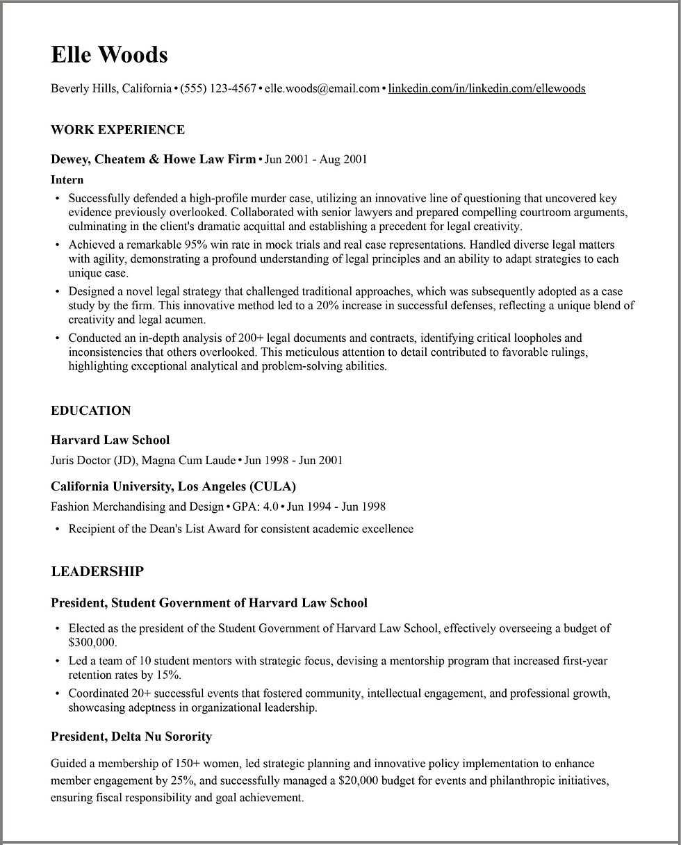
Example of Resume with Balanced Content and Design
Let's consider Elle Woods, a fashion major aspiring to enter Law School. Her resume adheres to a more standard structure, given the legal profession's formal nature compared to the creativity of fashion. However, Elle can incorporate a professional shade of pink and use rounder fonts to accentuate her femininity, effectively setting her apart. This choice also symbolizes her pride in her identity as a woman in a male-dominated field. Notably, she has introduced lines to delineate distinct sections, enhancing overall readability; this can show conscientiousness. Additionally, the inclusion of her volunteer projects showcases her interests beyond the legal realm. Through this resume, Elle effectively presents her well-rounded character, demonstrating her compatibility with the legal profession while also highlighting her unique qualities.
Note that these recommendations can vary depending on how your resume reaches the hiring manager's desk. A referral from a trusted contact can elevate an average resume, underlining the importance of networking in job searches.
While both content and design are critical, our survey results stress a higher emphasis on content. However, design should not be dismissed; instead, it should support and enhance content, not overshadow it. Knowing when and how to leverage design, and understanding what hiring managers value, can make a critical difference.
After all, a resume is more than just a document—it's a potent tool that can open doors to new career opportunities. Thus, let it narrate your professional story in the most compelling manner possible.


Comments